当前位置:
A963设计网>
作品分类 > 室内设计 > 餐饮空间 > 黃金旭作品
大中華國際美食館
8602
2014-10-13T14:00:55
17
[佳作]
基地坐落於彰化和美,比鄰農地,有別於市區的繁華喧鬧,因曾經是製作雨傘骨架和紡織的重鎮,故又稱「織女的故鄉」,在位居郊區開發中的城鄉市鎮來說,富有著傳統文化及東方意象。就婚禮意涵來說,傳統東方文化即遵循古法,按部就班;而西化的思想則是開放不拘,本會館如何保留當地人文特色,塑造東方氛圍並融入現代設計手法,是設計師的思考重點。
此案設計以「編織」為發想,以「線」為設計架構主軸,希望營造出東方的韻味並結合西方現代元素,給時下新婚年輕人能有多樣性的一個味覺饗宴。在空間的故事架構中,點的移動軌跡,轉化為時間線的流動。交錯成網,編織成面,營造出立體空間的氛圍。
在接待大廳挑高天花板的方體造型頂蓋,加入橢圓形玻璃水晶管元素燈飾設計,以東方古時官帽形的意涵為主體,運用線的律動,形塑融合古今傳統與現代的觀念,在看似平靜、挑高8米5的接待大廳,激起一絲漣漪。在色彩表現上以金色及咖啡色調擁抱空間架構,將主體色彩以不同材質、形式呈現,搭配金屬構件、雲石光牆,營造空間內斂沉穩的步調,藉以隱喻傳統的文化意識。另將茶鏡及壁布交錯運用,虛實之間,代表著空間中時間經過,意識型態的漸變融合。
空間配置上採半開放式,透過金屬鐵件組合、介質變化,劃分各個機能場域,如:前後交織的金屬方管組合透明玻璃、十字交錯的金屬框架組合透光雲石等,構築虛實、前後、輕重的層次,在看與被看、滲透與層次、引導與暗示、疏與密中串聯各個場域的表情,引領消費者浸入悉心鋪陳的氛圍裡。
接待大廳連結至包廂外的天花板以黑檀木皮延伸至壁面,藉以區分包廂空間及梯間區塊,包廂區廊道的壁畫,是引領至此空間的亮點,設計師利用暗紅色調搭配具故事性的圖案、線條,創造空間內涵的變化。與貳樓間,以曲線、簡化的欄杆線條傳遞時代感,空間立面的黑色鏡面,除了加深場域圍塑的安全感,與壁畫之間也反映了時間對話的信息。
另外在宴會廳的設計表現上,採各廳不同的設計形式,讓消費者有多樣選擇性。
前棟宴會廳中,有天花板以線條和線條產生的折點,形構不同方向的面,進而發展出如「鑽石」般意象,和星光大道映出天地之間,連結壁面茶鏡的變化,為整體空間帶出現代科技律動感,營造時下新婚年輕人追求的視覺饗宴。
後棟宴會廳中,在設計轉化後取其線條、色彩,經由堆疊、簡化、變形,延伸其架構至天地壁。設計師運用紅色的演色性進行調配,隨著裱布形塑的區塊,步步構築東方幸福氛圍。透過燈光鋪陳深化空間的故事性,與接待大廳金屬構件組合的交錯造型前後呼應。
本案主體架構以層層堆疊的設計手法,利用線條粗細及方向性,構思時代與文化衝擊的對話,人與空間在此衍然演譯一場人生最重要的戲碼。
The wedding hall is situated next to a farmland in Hemei, Changhua, and thus is distinct from the hustles and bustles of urban cities. Hemei is also referred to as “the weaver’s hometown” because it was previously a major producer of umbrella frames and woven materials. Compared with other developing urban and rural areas, Hemei is rich in traditional culture and Eastern influence. Traditional Eastern culture requires weddings to adhere to traditional practices, whereas Western culture is liberal and unconstrained. The design concept of this hall focused on preserving the uniqueness of the local culture to create a Western atmosphere while simultaneously integrating contemporary design techniques.
This design was inspired by the concept of weaving, the primary design framework of which was threads. The goal of the design was to infuse Eastern elements with contemporary Western atmosphere to provide young newlyweds with a diverse sensory experience. In the framework of the spatial story, the trajectories of moving points transformed into flowing timelines that interlace to form nets and weave to form planes, creating a 3-dimensional spatial atmosphere.
An 8.5-m high square ceiling with an oval glass crystal chandelier was chosen for the reception hall to recreate the shape of official headwear from the Ming dynasty. The rhythm of lines was used to represent the integration of tradition and contemporary concepts, creating ripples in the seemingly tranquil reception hall. Gold and brown hues, incorporated using various materials and forms, are coordinated with metal components and marble light walls to create an understated calmness that signifies an awareness of traditional culture. In addition, tea-color tinted mirrors and fabric wallpaper were combined to create an almost surreal environment representing the fusion of changing ideologies through the passing of time in space.
Semi-open space allocation was employed in the design. Functional areas were divided using combinations of metallic iron and variations in media, such as combining transparent glass with crosshatched square metal pipes, and merging translucent marble with grid-patterned metal framing. The construction juxtaposed the concepts of real and surreal, front and back, and light and heavyweight. The expressions of each functional area were connected by the concepts of seeing and being seen, permeation and levels, guidance and cues, and sparse and dense, to immerse consumers in the meticulously designed atmosphere.
Ebony was adopted to construct the ceiling that connects the reception hall to the outer wall of the compartment, extending through the compartment wall to separate each compartment from the staircase area. Frescos line the corridor leading to the compartment, drawing attention into the space. The designer mixed dark red hues with narrative patterns and lines to create variations in spatial content. On the second floor, curves and simple railings were used to convey a sense of time. The black mirror erected in the space not only deepened the sense of security, but also echoed the dialogue of time through the frescos.
Banquet halls varied in design to provide consumers with multiple choices.
In the banquet halls located in the front building, the breaking points between lines on the ceiling formed surfaces with varying directions, further developing the diamond-themed imagery and a walk-of-fame-like walkway that reflected variations of the tinted mirrors on the walls. Thus, a space featuring a contemporary technological rhythm is created, yielding the visual aesthetics desired by young newlyweds.
The design of the banquet halls situated in the rear building incorporated transformed lines and colors, and a stacked, simplified, and deformed structure extended to the ceiling, the ground, and the wall. The designer used a red color scheme and upholstery to generate a pleasant Eastern atmosphere. Lighting deepened the spatial story, which reflected the interlaced metal components of the reception hall.
Stacking was the primary design technique used for this case, in which the thickness and direction of lines were employed to construct conflicting dialogues between time and culture, as if people and space have recreated the most crucial scene in life.

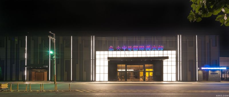
建築外觀

平面圖
免责声明:A963设计网作品由网站注册会员发表,本网站对其作品的版权未作证实,对作品的原创性、真实性不作保证,也不承担由此产生的法律责任。未经本网站及作者授权,请勿转载。如对作品版权有疑议,请及时与我们电话联系:0755-83869208 QQ:4000168963

