- 首页
- International
- 艾特奖
- 文化节
- 服务体系
-
网站导航
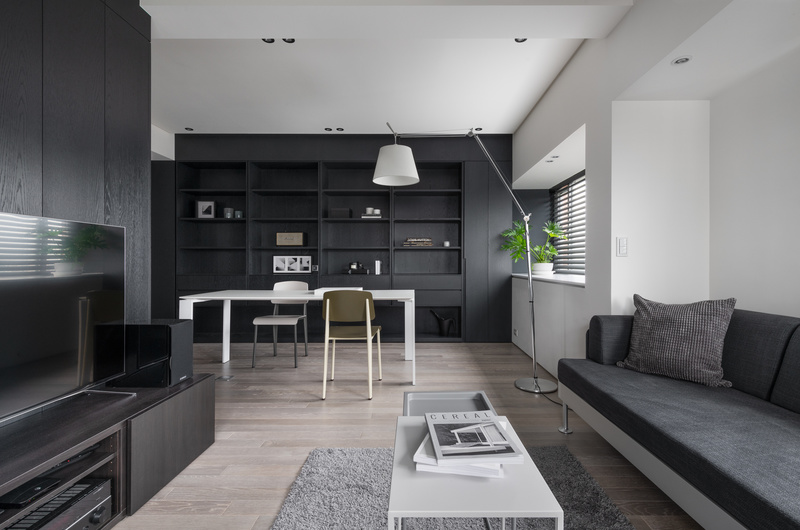
以基地的光與景觀為敘事主軸,將原況基地封起的進光面恢復並導入自然採光,並依照業主生活習性重新分配各區域在日照區內的範圍比例,以光為設計導向,凸顯此基地原生採光優勢並同時達到節能的效果。在有限空間內置入最少量化的牆體劃分公私領域之界線與轉折緩衝,並以黑色木皮量體定調出空間中的動線軸與視覺景深。在開放式的公共領域中,藉由基地原有樑位與黑色木皮櫃體的分割勾勒出不同區域屬性的隱性分界,使各區域即使在疊合下也能使其機能屬性得以凸顯與運用,同時保有空間的連續性。灰黑色系的重複運用於不同材質紋理的介面上,使空間呈現統一洗鍊感並回歸於純粹,強化以沈穩結構敘事的空間印象,並強化空間紋理與光影之間的精微對話。
Tailoring the scenery and light as the narrative motif, we unveiled the existing blocked window and reintroduced natural light into the space, furthermore, we relocated and resized each zone by analyzing the client’s life habit. By adopting the light as a design element, not only we highlighted and utilized the existing advantage but also meet the energy-saving purpose. For this limited yet opened space, we introduced minimum walls to set and buffering the boundaries between public and private area. The opened public space was divided into different zones with blurred boundaries by those existing ceiling beams, the black bookcase volume, so even zones are overlapping with each other but still possess their own function and also maintains the cohesive flow in the space. We applied the monochrome color onto different material textures, in order to enhance the sense of sleek and refined impression, also aimed to enhance the subtle dialogue between space, light and its exterior scenery.


