- 首页
- International
- 艾特奖
- 文化节
- 服务体系
-
网站导航
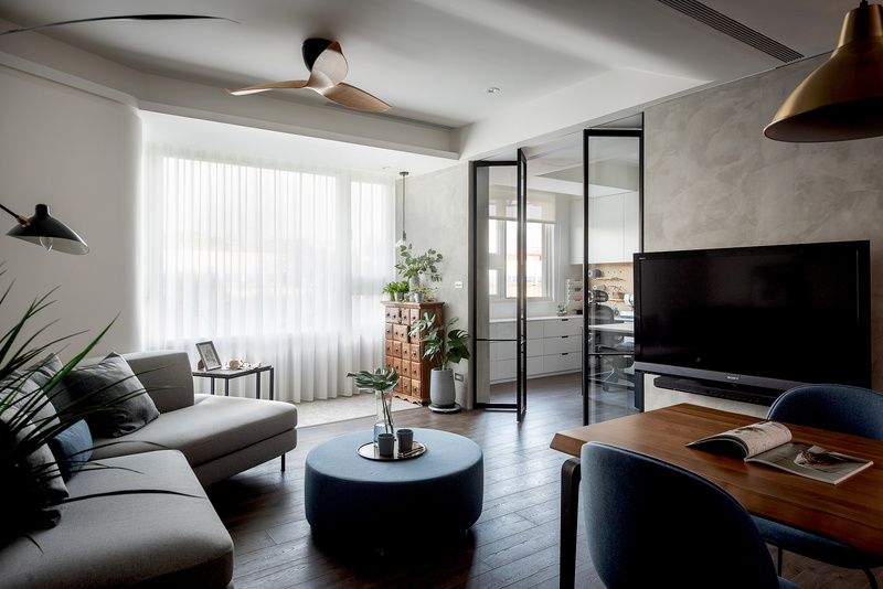
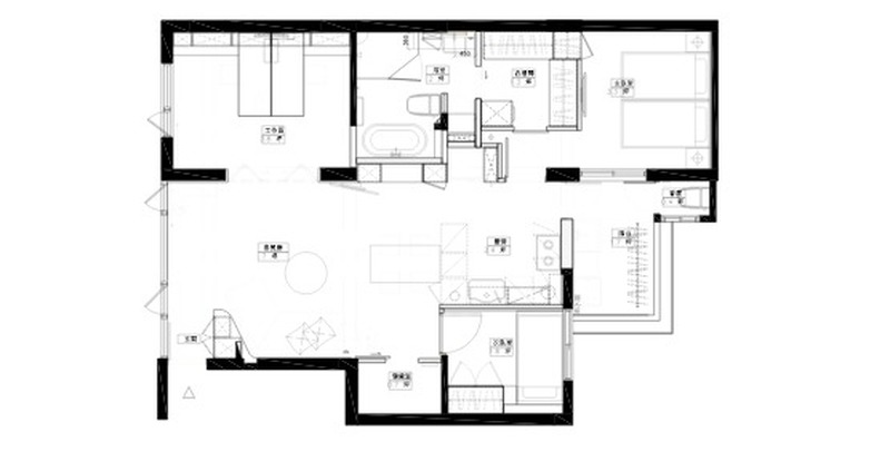
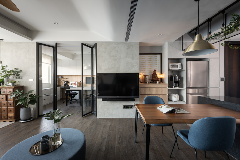
設計團隊除了發揮原有簡約層次空間設計美學,並從業主的喜好以及物件的地理 環境作為融入設計概念的發想。從業主背景從事印刷廣告業以及喜好手作、烹飪 、植栽的興趣中,設計團隊將這些喜好帶進每個空間的設計,有的轉化為空間的 手感材質表情、有的在空間角落營造出屋主的喜好所在。此外,從地理環境機場 的起降滑行帶來靈感,找到老屋翻新的突破口:弧形線條可以化解原有樓板樑及 設備的高低差變化,除了有拉高天花板的視覺效果,也作為牆面與櫃體的整體雕 塑般的造型,也呼應包浩斯的設計精神:形隨機能.
Overall Design Concept: Apart from bestowing the minimalist layered spatial aesthetics, the design team was also inspired by the interests of the clients and the geographic environment of the site in developing the creative concept. As the client’s background in printing and advertising industry and his love for handcraft, cooking and planting, the design team infused all these interests into the interior design, as some were represented in the materiality, and others were shaped with the client’s interests. Furthermore, the landing, take-off and taxing, have also brought about inspirations for the renovation of this old residence, where arc line work resolved the height differences between structural beam, floor and appliances, which elevated the ceiling visually but also provided the overall formwork of elevation and cabinet volume as well as echoing the Bauhaus design mantra of “Form Follows Function”


