- 首页
- International
- 艾特奖
- 文化节
- 服务体系
-
网站导航
基地是附屬在母公司建築外側的辦公空間,原始平面與建築物外側玄關區的弧形牆沒有產生關聯性,我們則希望空間與建築物產生更多的對話性,因此在設計入口處時創造了一道弧形的牆面串連兩空間的關係,增強原有空間與母體辦公室的連結性,利用材料去營造空間之間的連結。
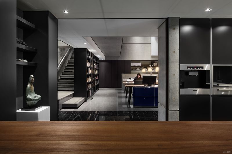
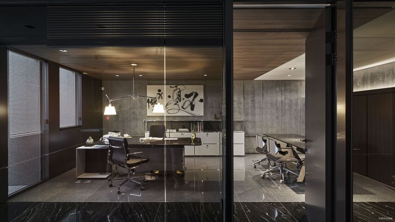
入口改為側面進入的動線,這樣的動線也增加了空間的緩衝;進入空間先看見的即是後側的自然光所帶給我們的視覺引導做為動線的指向性,而將挑空的位置放在工作區,達到先收再放的效果。地坪的顏色與書牆區分工作區與多功能區,而行進動線的終端設置了落地窗,引入綠意與天光,工作區因書牆而降低了多功能區的干擾與西曬,提供更為安定的作業環境,後方設置了建材展示區與選樣區,提供使用者收納建材與討論的空間,在該區設計上亦延續了清水模的元素,期待在空間中使用最少的材料,創造空間的延續感。
空間利用垂直書牆營造穿透樓層的視覺感,刻意將上下書櫃整合,增加兩樓層的連結性,將相同的語彙做垂直向度的延伸,打破了樓層之間的疆界。樓梯則扶書牆而上,使用者在上下樓梯的同時,不僅降低對工作區的干擾,更可與藏書產生視覺與記憶的連結,而踏階則以植筋的方式輕觸於牆面,呈現出輕巧的視覺感,讓每一階獨立的踏階就像是漂浮在空間中,也藉由樓梯下方的平台消滅樓層上下的壓力,舒緩樓層之間的衝擊。
在設計上提煉出貫穿於空間中的幾合力量,延續垂直向度的風格樣式,營造極致的視覺和場所感,希望人與空間產生共鳴,而非只是單純的辦公場域。
The space is an office near outside of the headquarters. Originally the plane is not related to the curved wall at the entrance outside the architecture. The design hope to create more coordination between space and architecture. The curved wall at the entrance is created to connect office and headquarters, by using stone materials extend to interior space from outdoors.
The side entrance breaks the original pattern and makes the buffer for the original route in the space. The first sight after entering the space is the back of the natural light brought to our visual guidance as the direction of the line.The atrium space is located at the working area to achieve the effect of flexibility. The colors of the floor and book wall separate working area and multi- functional area.The French windows are set at the end of movement path to lead the sunshine and green inside.
The multi-functional area provides conference, dining, snack kitchen and so on. There is a long window at the west side to make the outdoor Landscape pool scene visual from inside.Because of book wall, the interference and west sun exposure at working area are decreased, and more stable working environment is provided.The display area of building materials and samples are set behind to provide users a place to collect and discuss, the concretes used on short wall and the wall surface. It is hoped to use the least material to make the biggest effect of extension.The small angle and high lumen light source is used at working area with empty space to decrease the weakness of long light projection. The table light is set at the table to provide single spot projection, and different halo is used to create different arrangement in a space.
The book wall is used to make the sense of penetration between floors.By combining the upper and lower bookcase, the connection between two floors is increased, and the boundaries between floors are removed. Stairs go up with book wall, so that the users can have the visual and memory connection with books and the interference to the working area can be decreased. Steps approach to wall by planting bars and present light visual sense to make every single step like floating in the space.
Geometry and vertical style design create an extreme vision and atmosphere. Hopefully it is not only a working space, but also a space with resonance from people.

multi- functional area

multi- functional area

Office